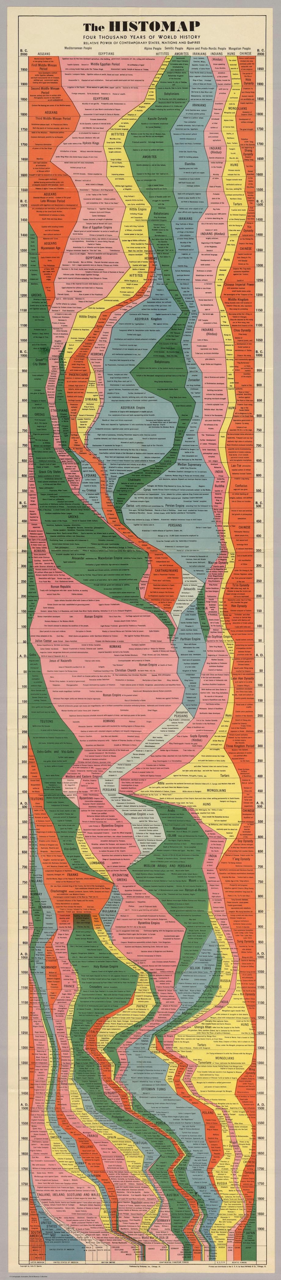
Created in 1931 by John B Sparks, 'The Histomap' outlines four thousand years of human history, charting the rise and fall of cultures and civilisations. Tracing the undulating, bulging and contracting columns provides a brilliant and easily digestible visual indication of not only the size and influence, but also the longevity of these civilisations.
You can trace the Egyptian civilisation, for instance, from its broad-shouldered beginning (albeit halfway through the Middle Dynasty) at the top of the chart to a barely perceptible trickle that creeps its way down to finally meet up with the enormous bulge of the Roman Empire.
Others - such as the Ethiopians - disappear almost as soon as they have appeared, whilst the Huns remain an unassuming yellow line on the right hand side of the chart until the rise of the Mongolians around 450AD.
The clear layout and flow of the Histomap also demonstrates the evolution of different groups within a single civilisation, as highlighted through the ebb and flow of various Indian groups, all within the same, unbroken band.
Click on the smaller version below to zoom in.
See here for the full article.
No comments:
Post a Comment